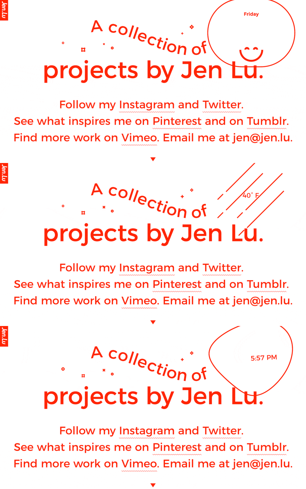
I can’t believe I found another wiggly underline decoration. This time it features a different design and a different file format, but a similar way of implementation.
Let’s see how the Bell Brothers achieved the wiggly underline text decoration in
Jen Lu. They are calling it ZIGZAG.
For those of you who don’t know what I’m talking about, a few months back, I wrote an
article about The Outline website and how they combine SVG and CSS to achieve a wiggly underline text decoration and recently I seen this tweet:
I was intrigued when I seen the title of the site: {{ pages[currentPage].title }} so I decided to check it out and I’m glad I did.
The first thing that caught my eye was the cool clock ticking on the right upper corner, how it changes to date and temperature every time you refresh the page. And the big mouse cursor.

Then, the more time I spent on the site the more I discovered these cool designs, like how you can click and swipe left or right on the site and the changing copyright ball.
Not enough cool things?
Visit the Bell Brothers website and make sure to look at their eyes.
Now, let’s zigzag our way in (pun intended) and start talking about what they designed.
The Bell Brothers took a similar approach to The Outline to achieve the Zigzag underline decoration. A PNG file combined with CSS animation.
Here’s the Zigzag PNG file:

As you can see, it’s really tiny, yet it will change the way underline looks with a bit of CSS animation magic.
Here’s the CSS animation:
animation: zigzagPlay 2s infinite linear;
@keyframes zigzagPlay {  0% {    background-position: 0;  }
  100% {    background-position: -96px;  }}
To inject the PNG file into a link, the BellBros are targeting the link with a class and using [background](https://developer.mozilla.org/en/docs/Web/CSS/background) CSS property combined with [:after](https://developer.mozilla.org/en-US/docs/Web/CSS/::after) which is used to inject anything after the selected element.
Here’s the full code:
<a href="https://ahmetalmaz.com/" class="zigzag"></a>.zigzag { display: inline-block; position: relative;}
.zigzag:after { content: ''; height: 5px; width: 100%; position: absolute; background: url('./_assets/zigzag_underline.png'); background-size: 8px; top: 35px; bottom: 0; left: 0; -webkit-animation: zigzagplay 2s infinite linear; -moz-animation: zigzagplay 2s infinite linear; -ms-animation: zigzagplay 2s infinite linear; -o-animation: zigzagplay 2s infinite linear; animation: zigzagPlay 2s infinite linear; -webkit-animation-play-state: paused; -moz-animation-play-state: paused; -o-animation-play-state: paused; animation-play-state: paused;}
.zigzag:hover:after { -webkit-animation-play-state: running; -moz-animation-play-state: running; -o-animation-play-state: running; animation-play-state: running;}
@-webkit-keyframes zigzagPlay { 0% { background-position: 0; }
100% { background-position: -96px; }}
@-moz-keyframes zigzagPlay { 0% { background-position: 0; }
100% { background-position: -96px; }}
@-ms-keyframes zigzagPlay { 0% { background-position: 0; }
100% { background-position: -96px; }}
@-o-keyframes zigzagPlay { 0% { background-position: 0; }
100% { background-position: -96px; }}
@keyframes zigzagPlay { 0% { background-position: 0; }
100% { background-position: -96px; }}That’s all. Now you have a zigzag underline text decoration.
An article of this kind wouldn’t be complete without a demo
Glad I was able to find a new clever way of animating underline text decoration.
Hope to see even more things like this.

